If you have been updated with the recent developments in the Google World, then you might have heard of the latest update from Google. This was initially being called it as “#Mobilegeddon” and later changed it to “#april21# because they were rolling it out on 21st of April. #Mobilegeddon gave an impression of an impending disaster which I think was unfair on the change.
Google updates have always been looked upon as a disaster, thanks to the rejig that the Panda and Penguin updates brought about in search rankings. These updates could have been disastrous for some but it also benefited some who went about doing SEO genuinely. Most of the sites that got affected due to these updates were the ones who thought they could rig the system. I agree that in the ensuing chaos some good sites would also have been impacted, but the truth is that these updates were for the better of internet and us.
Having said all this, I should also say that I am a believer that Google plays the monopoly cards when it comes to a lot of aspects like paid search.
Nevertheless, the latest update was an anticipated one and much in line with the recent technological changes. Internet is becoming more mobile with the number of mobile users increasing everyday.
About 60% of online traffic comes from mobile users and it was only right that Google rewarded sites that were mobile friendly.
So here is the latest Google algorithm update as per Google webmaster blog –
We’re boosting the ranking of mobile-friendly pages on mobile search results. Now searchers can more easily find high-quality and relevant results where text is readable without tapping or zooming, tap targets are spaced appropriately, and the page avoids unplayable content or horizontal scrolling.
This update:
- Affects only search rankings on mobile devices
- Affects search results in all languages globally
- Applies to individual pages, not entire websites
While the mobile-friendly change is important, we still use a variety of signals to rank search results. The intent of the search query is still a very strong signal — so even if a page with high quality content is not mobile-friendly, it could still rank high if it has great content for the query.
So, in simpler terms it means that your site is more likely to appear on the search results on a mobile phone, if it is mobile friendly. Google, had also shown a screenshot of how a mobile friendly site will look in Mobile search results post the update, on their blog.
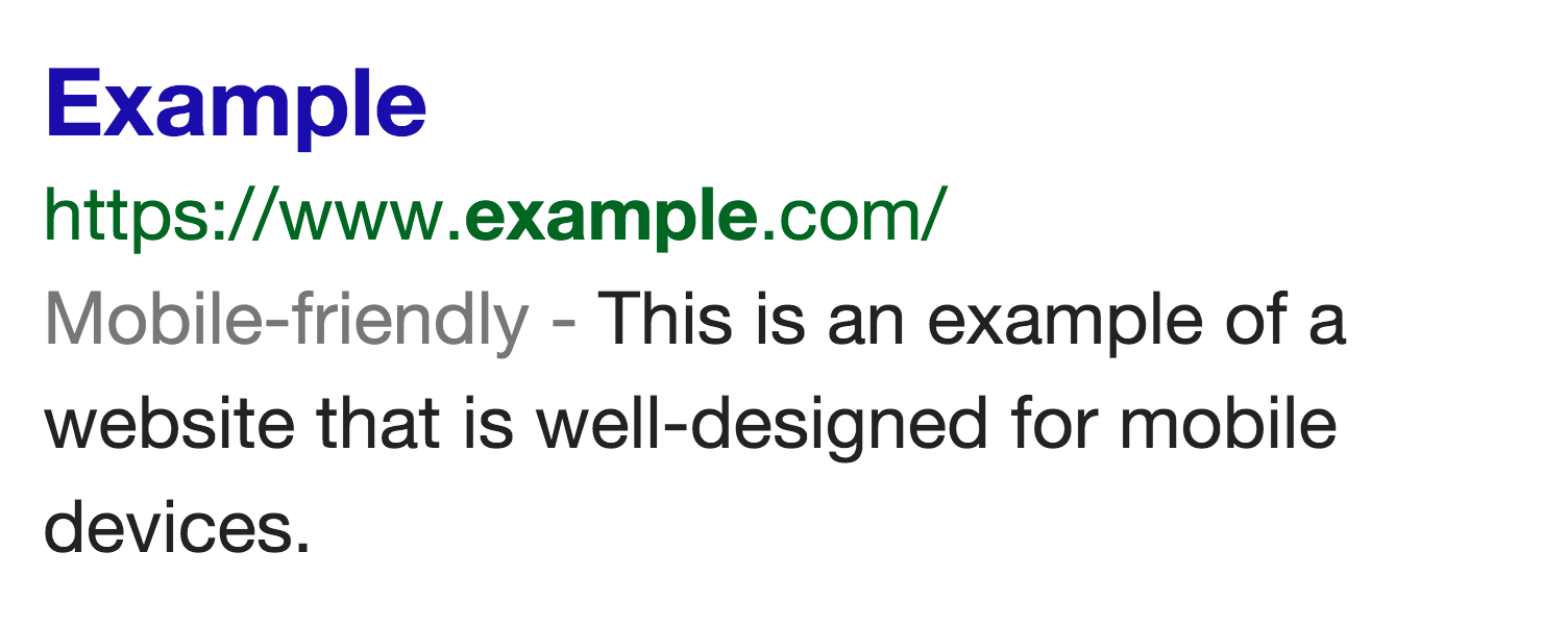
This also means that if your site is not mobile friendly, it might just not appear on Google’s search results. And I am sure you would not want to miss out on the 60% and growing online traffic from mobiles.
Your site might just not be the one that is affected, if you are not using a responsive theme for your blog. Techcrunch reports that more than 40% of the Fortune 500 websites could also be impacted with this new update.
While this update will reward sites that have a responsive design and are mobile friendly, this also means a huge opportunity for offline marketers who can design mobile friendly websites. You can start pitching your services to companies who do not have a mobile friendly website. And from a sample study that we did with manually searching (web search) for websites in 7 different niches for 30 different high-traffic keywords, we found that 63 sites out of the 100 sites on the first page of Google in the web search were not mobile friendly.
But the objective of this post is not to promote an offline business, but it is to show you how to make your WordPress Blog mobile friendly, so that you don’t get penalized with this update.
How to Make Your WordPress Blog Mobile Friendly
As soon as the details of the update started appearing on the internet, people started searching for ways to make their website mobile friendly. Some switched themes because their themes were not responsive and hence did not adapt to reduced screen sizes. Yet others re-designed their themes to create mobile friendly alternatives for their sites.
There is nothing to panic. This update is not as severe as a Panda or, Penguin. And prepping your site for this update is also not difficult. In fact it is rather easy.
So here is what you should do to ensure that you don’t be in the receiving end because of this update.
STEP 1 – Check if your site is mobile-friendly
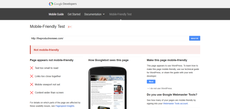
The first and obvious step is to see if your site is mobile friendly and if Google is seeing your site as a mobile friendly one. You need to head over to the mobile friendly test site to check that. Go to https://www.google.com/webmasters/tools/mobile-friendly/ and enter your url to check your sites appearance on mobile phones.

Once you have entered your site, you should get a response saying a yes or, a no depending upon the responsiveness of your website. If you get a message like the one below, then you need to work towards optimizing your site for mobile phones.
So, once you have figured out the responsiveness of your website let us move onto optimizing your site for mobile phones.
STEP 2 – Install Jetpack Plugin
Jetpack plugin is a free plugin from the creators of WordPress. When you go to the install plugin screen on your WordPress dashboard, the first plugin that you will see is the Jetpack plugin. Go ahead and install it.
Once you have installed it, go to the setting screen and you should see something similar to the below screenshot.
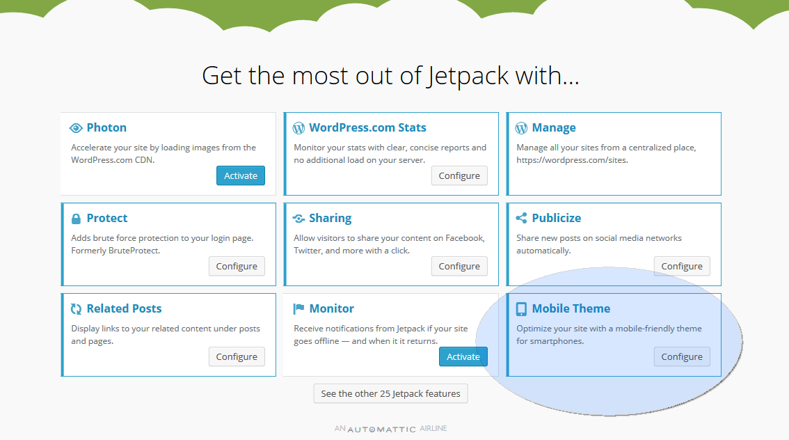
Here you will find an option called “Mobile Theme” as in the above screenshot. If for some reason you are not able to find it, you can use the search box that you will find on the settings screen and search for “mobile theme”.
Activate this option. Once it is activated, you will find an option to “Configure” as in the above screen. Till it is activated, you will find the “Activate” button instead of the “Configure” button as in the image above.
You will then be taken to the below screen to configure the options. Configuring is pretty simple. It is just about a couple of options that you have to select.
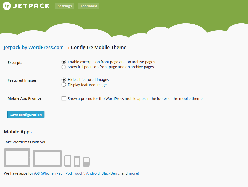
Once done, save the configuration and that’s it. Your site is now mobile friendly. Head over to the mobile friendly test site and check for the responsiveness and you should be able to see a GREEN signal from Google.
You can watch the complete walkthrough video below –
I hope you liked this post and that you were able to make your WordPress blog, mobile friendly.
Do let me know your thoughts by commenting below. In case you liked this post, don’t forget to share it with your friends and circles by clicking one of the “Social Buttons” just beneath this post.


Replica Merchant account helping worldwide business along with the setup of virtual merchant and services such as card services and bankcard services.