This is a guest post by one of our Guest Bloggers. You can read the guidelines to guest posting on our blog here.
Website acts as a virtual representation of your company or business. Thus, having a compelling and unique website is not an option rather mandatory to survive in the present competitive marketplace.
Although building a website is not difficult but the real challenge lies in making it usable in the best possible way.
Top 5 web design mistakes made by Businesses
To help you come up with a clean and engaging website design, here we have compiled 5 most common mistakes that small businesses make.
These are some easily fixable web design mistakes that shouldn’t take you long to fix. And fixing them could straight away show an improvement of more than 50% on your conversions.
Poor Navigation
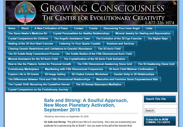
Navigation plays an important role in the success and failure of a website. An effective navigation is intuitive, user-friendly, and users are able to breeze through the website effortlessly and find information they are looking for without any distraction.
On the contrary, if your website has poor navigation, then users will have a hard time exploring your site and I am sure you don’t want that. So, make sure your website offers a clean navigation so that visitors are able to swiftly visit through your site and get a seamless experience.

image source-vandelaydesign
Best Practice-Position your navigation bar at the top of the page so that visibility to the users is ensured. If required, you can add an easy-to-find site map in your main navigation bar so that visitors can have a view of every web page on your site whenever needed.
No Clear Call-to-action
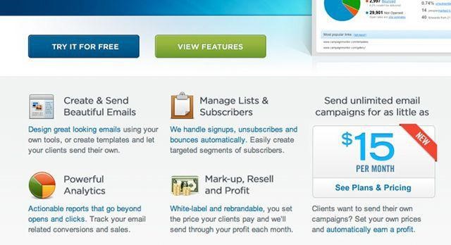
Many small business websites make the fundamental error of not having a clear call-to-action. The very purpose of having a CTA gets defeated when users are not able to locate your CTA buttons or find it complex or confusing.
Your CTA buttons needs to be placed in a way that users can’t help but click. Once users have found your website, what you want them to do next?
CTA buttons have a specific goal, you want users to sign-up for your Newsletter, buy your product, download your ebook, or register for any subscription etc.
You can achieve the end goal of conversion only if your call-to-action is well-placed and clearly tells user what action they need to take.

image source- mashable
Best Practice-To ensure the efficacy of your CTA buttons, place them either above the fold or below the fold on the web page. Using action-packed text on your CTA buttons also works like magic such as Try our free email marketing tool, Download our Free ebook, etc.
Stale or dated content
A well-designed site with stale or dated content will do more harm than good to your website. If your website is not updated with the latest information about your product, services and company or related events then users may assume that you’re not serious about your business or, you are not in business any longer.
To add credibility to your site, you need to constantly add fresh and engaging content to your site, it will help you drive traffic to your site besides keeping search engines happy.
Best Practice- Update your site by regularly adding content in the form of blogs, articles, videos or inforgraphics.
Unfriendly Screen Resolution
A good web designer cannot underestimate the power of a website design that fits most of the screens. Users these days browse website from so many devices including mobile and other handheld devices, so having a responsive website design is the most ideal option.
A responsive website design adapts to the screen irrespective of the device and delivers a optimal viewing experience to the users. Besides, Google is also rewarding sites that are responsive or in other words fully optimized for mobile platforms.

Best Practice-If you are not sure about having a responsive web design or mobile site then you can consider having a mobile app to give a mobile-friendly experience to the users.
Complicated Registration Forms
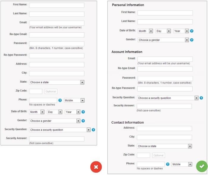
Registration forms are a tricky part and your website can face high bounce rate in case your registration forms are not up to the mark. It has been observed, short and simple registration forms do better than long and lengthy forms.
A registration form that asks for a zillion details, turns users away. Again, registration forms that makes most of the registration fields mandatory and validate the fields to an extent that often leaves users frustrated and they leave after few failed attempts.
Remember, a user visits a website to acquire information and will only be interested to fill your registration form if it is quick and easy.

Best Practice: Make sure your registration form is designed with a logical sequence pattern such as First name followed by middle name or last name etc.
Wrapping Up
The above-mentioned are most common website mistakes that often hurt the overall functionality and design of a website. Avoid these and I am sure your website will provide an error-free and stellar experience to the visitors.
Author Bio:
Campbell Jof is a Creative Head for Designhill, as well as a blogger and designer. He writes on topics concerning design, eCommerce, start-ups, digital marketing, and interactive content. His creative work has earned him several laurels over the years.


I am professional but honestly, I also did some of these mistakes many times in my whole career.